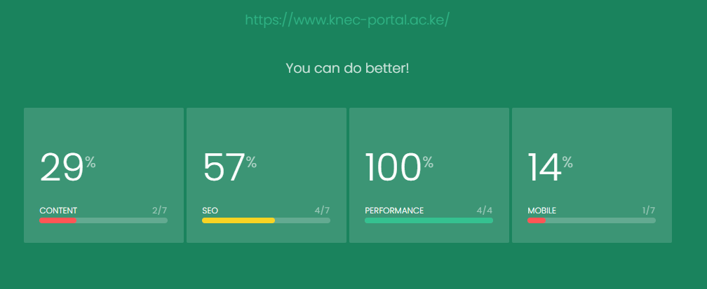
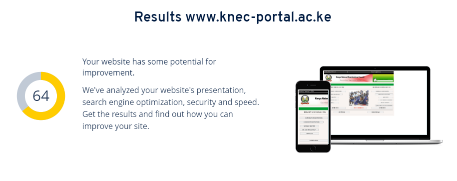
https://www.knec-portal.ac.ke/
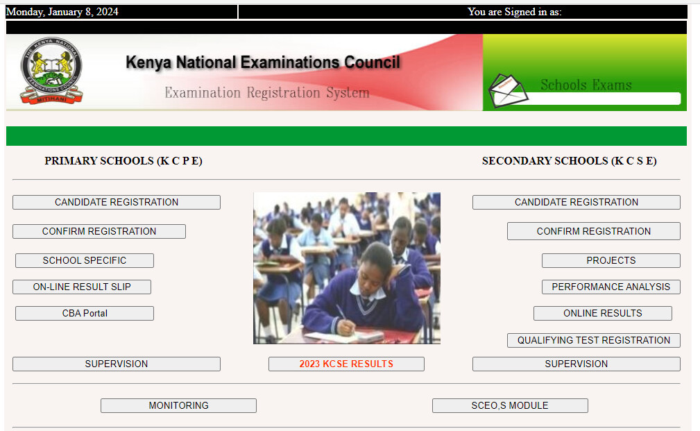
You would expect that a Web Portal for such a distinguished department in a vital ministry such as that of Education would be easier to use and appealing to the eye but NIABM and cannot manage sh!t.
https://www.knec-portal.ac.ke/
You would expect that a Web Portal for such a distinguished department in a vital ministry such as that of Education would be easier to use and appealing to the eye but NIABM and cannot manage sh!t.
So what is wrong with the website? In engineering, including software engineering we use the principle of KISS (Keep It Simple, Stupid/Straightforward/Short/uSable).
Maybe they chose to use few graphics to make it faster and easier to access for everyone.
chief bonobo ndindu highly overates his little knowledge if any
[quote=“Ndindu, post:6, topic:467717”].
[/quote]Performance is what matters and they are rated at 100%. Don’t be obsessed with form over function. KISS (Keep It Simple, uSable).
Naona Iko tu sawa and simple. Ata mlika mwizi will be able to check results na 2G somewhere mashinani