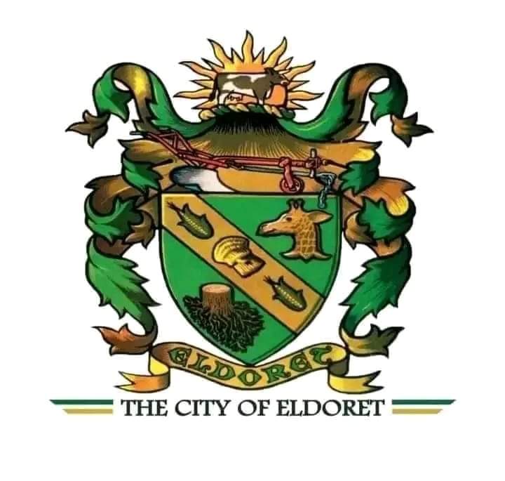
green baroque coat of arms iko sawa lakini wangetoa hio ngombe na plough hapo juu, very shody copy paste
Looks like tatters.
proudly done using word by cyber cafe attendant
@sokwemtu
Unnecessarily busy. They should borrow a leaf from Arch. Gatimu who did the Jkuat logo years ago. Or Arch. Makan who did the cck logo in late 2000s
Wamesahau wheelbarrow
As bad as this is, it’s 1000000x better than the old one. The diarrhea brown and green is the ugliest color combo nimeona hii maisha.
Maumbwa wameiba ata pesa ya kutengeneza a decent logo. Kalejinga ni wezi sugu!
Kuna Hadi Giraffe ![]() in the logo, fish swimming kwanza izo ni shark, na kisiki ya mti, surely what does a cut tree represent? @Billy_Graham mko na Giraffe anywhere in Sisibo?
in the logo, fish swimming kwanza izo ni shark, na kisiki ya mti, surely what does a cut tree represent? @Billy_Graham mko na Giraffe anywhere in Sisibo?
Hio ni broccoli, siet!
Munasema jamii ya wakisii ina dosari hadi mpate hawa watu
Wapi picha
Last niliziona I was in primary. Hii term city inarushwa tu cause LD ni center tu flani.
How is a broccoli stem brown? Why is it upside down?

Mkisii Wacha kutupima
![]()
Yes that’s the worst logo on this face of earth. Trying to compress everything in one logo. Nonsense and lack of creativity.
It should be simple and precise.
Hiyo icon kati kati ya hizo fish inakaa World Cup… City of Champions
Hizi design ni zile za medieval times enzi za kina King Arthur na Lwanda Magere. Modern logos are minimalistic having basic shapes. Anyways I wouldn’t be surprised if this “project” cost a couple million shillings
Lazima kuna watu wamekula a couple of millions to produce this abomination.
Fcuk these people and their northern giraffe gimmick. They lacked animals to represent their county? Cattle perhaps? Maize stalks? Teeth? Damn idiots. Thieves.
Teeth? You blalyfarkin